This was a fairly complicated assignment, not least because it is about colors and I was born with a red-green color deficiency (commonly known as colorblindness). Here's what I came up with.
One part of the assignment was to change the colors of a familiar object, hence we have a psychedelic sunset.

Another part of the assignment was to explore "Opposites" without using well-worn symbols. I really wanted to contrast the Artist and the Engineer as at least being on opposite ends of a spectrum in their common stereotypes. Part of the reason I wanted to do this is that I think many photographers (myself included) have a foot in each camp. Yes, I can geek out on gear and technique, and I love to make my own light modifiers. However, I do kinda care--a lot--about how things look, and I at least imagine that I'm creative. Anyhow, all that explanation is just so you know that I'm not so shallow that I'm just trying to depict the opposites of digital and analogue.
Engineer's watch (features, features, features... looks?)

Artist's watch (funky, chunky, and cool.... and analogue)

Another part of the assignment had to do with taking photos involving colors that we liked, and were attracted to, and those we were repulsed by. I found it difficult to be repulsed by colors. Especially all by themselves. Here's what I came up with, however:
Like

Dislike (mostly)

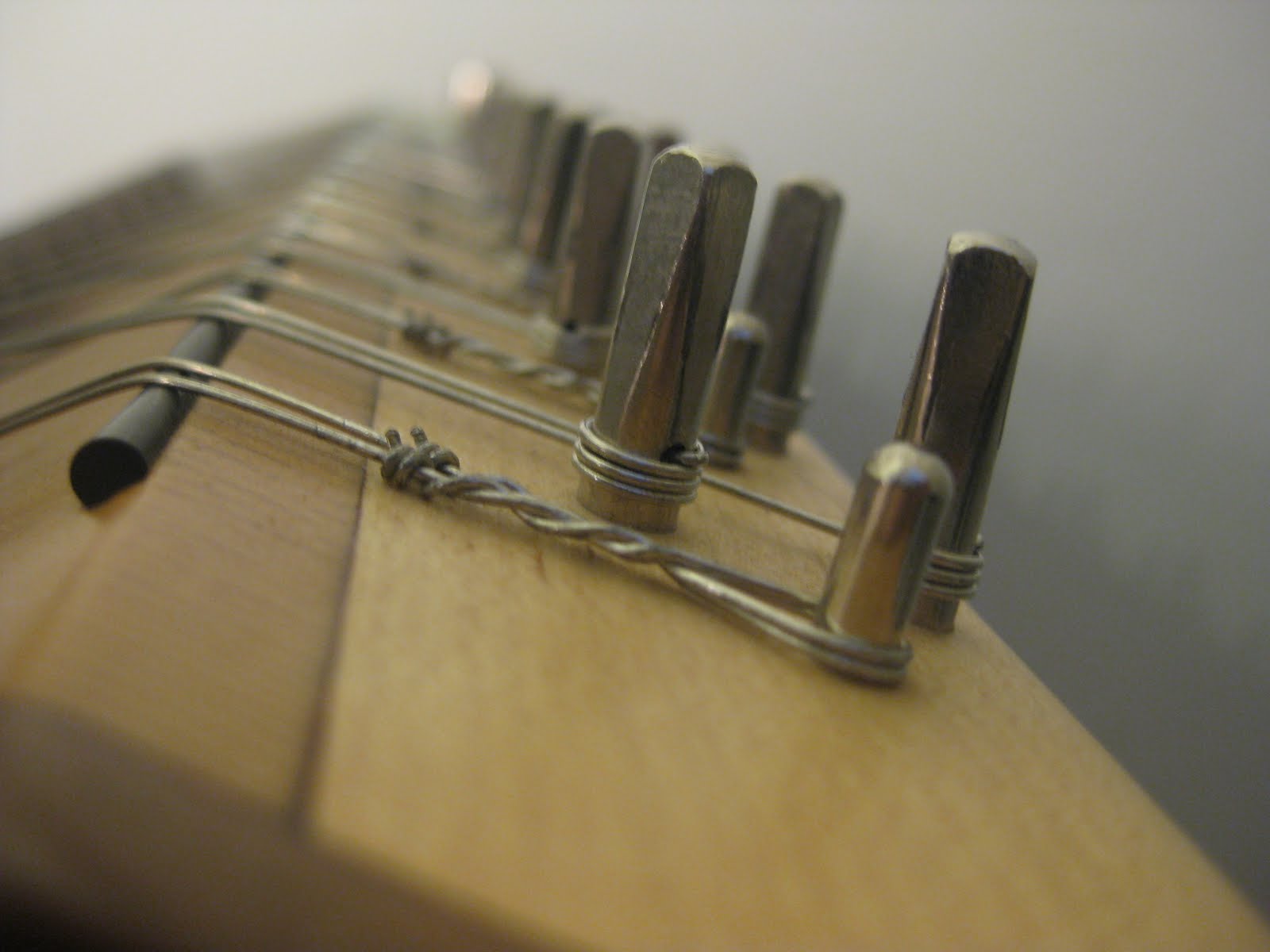
 Light and exposure.
 Perpetual motion!
 Another part of the assignment was to explore "Opposites" without using well-worn symbols. I really wanted to contrast the Artist and the Engineer as at least being on opposite ends of a spectrum in their common stereotypes. Part of the reason I wanted to do this is that I think many photographers (myself included) have a foot in each camp. Yes, I can geek out on gear and technique, and I love to make my own light modifiers. However, I do kinda care--a lot--about how things look, and I at least imagine that I'm creative. Anyhow, all that explanation is just so you know that I'm not so shallow that I'm just trying to depict the opposites of digital and analogue.
 Artist's watch (funky, chunky, and cool.... and analogue)
 Another part of the assignment had to do with taking photos involving colors that we liked, and were attracted to, and those we were repulsed by. I found it difficult to be repulsed by colors. Especially all by themselves. Here's what I came up with, however:
 Dislike (mostly)


 I love red. I am drawn to yellows and bright colors. Blues are calming.


 2.
2. 3.
3. 4.
4. 5.
5. 6.
6. 7.
7.


