It was featured on the front page of PDN, which is where I found it tonight.
On this Blog we will post our photos and look at the photos of others. Don't forget to comment!
Wednesday, September 29, 2010
The Impossible Project
Here's the link to the Polaroid film company I mentioned tonight. Thanks to David Dalbey (I think) for tweeting about this months ago.
Metaphors or Something
So here's what I was able to pull together for the metaphor assignment:
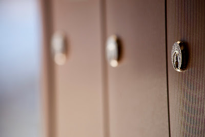
1. A locked box is about privacy, security, and secrecy. This lock highlights this because it's next to other boxes and locks of the same type. The focus on the near lock feels intimate increasing the implied tension since we don't know what is inside.
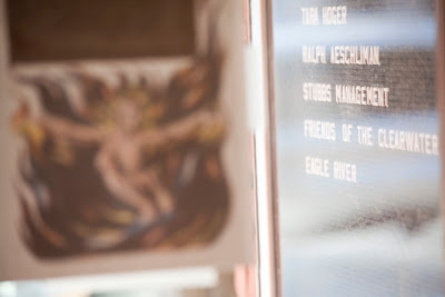
 2. This photograph speaks to me about the tension between the pragmatic practical street-sign side of our lives, and the spiritual/mystical reality of existence. What is that angel/demon/creature in flames that is blurry in the foreground? We don't know for sure, but that doesn't make it any easier to ignore.
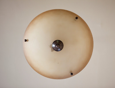
  3. Perspective can play with our minds. Rather than some specific meaning here, I see the potential for the mind to bend and create meanings, many of them hopefully... why? Because it's fun.
  4. This image is not so complicated but it still speaks to me. It means: industrial, steel, German, North, winter, efficiency, engineering, cold... but all as impressions, no explicit symbolism here.
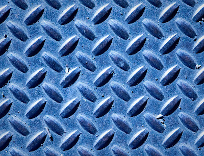 5. This photograph is the opposite of the one above. It means: summer, South, history, church, humanity, light, warmth. But it's not as simple, because the little spikes are almost industrial, and the overall repetition is also industrial, efficient, and engineered. Still, I think this photograph reminds me of the Mediterranean somehow.
Tuesday, September 28, 2010
Monday, September 27, 2010
His world
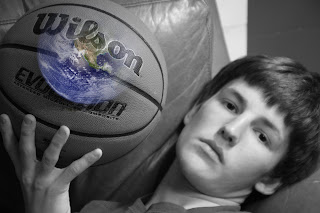
The assignment, to photograph a metaphor. I used photoshop to clone the earth and brought it into my photo of my son.
Wednesday, September 22, 2010
Tuesday, September 21, 2010
Couples
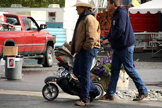
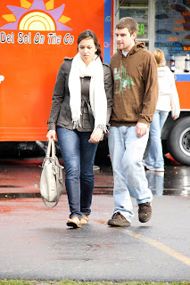
When I was at the fair on Saturday afternoon (without my camera) I noticed couples walking around. It was an interesting observation lesson. Young couples, teens and twenties, walked next to each other, arm in arm, hand in hand, bodies touching. Middle age couples, thirties, forties, fifties, with or without kids, walked in the same direction, not touching, looking at different things as they walked, even if they were talking. Older couples, sixties, seventies and beyond, walked hand in hand, or arm in arm.
On Sunday, when I had time (I worked all weekend), I took my camera with the intent of capturing that observation through my viewfinder. I also was trying to learn to bracket. It was a lot of fun and very educational.
These are two of the pictures, the rest are on my blog.
Pippi the Clown
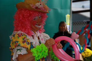
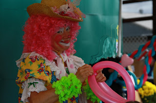
It was funny, when I started taking her picture she was very focused on her customers, her look says otherwise to me. I also tried to do a little in photoshop (help). The first is without photoshop, the second with. Suggestions on where to go, what to read, how to learn it would be helpful.
My snappy camera!
Monday, September 20, 2010
Friday Night At The Fair
The Fair As a Toy World
I received my new Olympus EPL-1 this week, and have been having fun with the "Diorama" "Art Filter" (more often known as "tilt-shift effect," after the "tilt-shift" lens used to invent and create many of the images). The effect, for me, is done digitally in camera and is a fun way to play with the effect without buying the extremely expensive lenses, or spend long hours, or at least minutes, tweaking images in Photoshop. When used really well it will make real life look like a miniature model. In a sense the Fair is, really, a miniature world of fun and games. And I took these photos to highlight that perspective on the fair.
I'm still learning how to effectively create this effect, but I had fun and thought I'd submit my efforts for the assignment this week.
A higher vantage point seems especially necessary
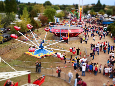 I think daytime worked better than night, but both are interesting, and have a kind of magical feel to them.
Sunday, September 19, 2010
http://cinnamonphotogray.blogspot.com/
Also...I am starting my own photography blog outside of this one, if you would like to check it out... http://cinnamonphotogray.blogspot.com/
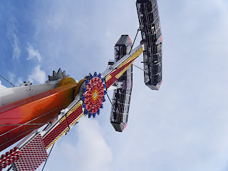
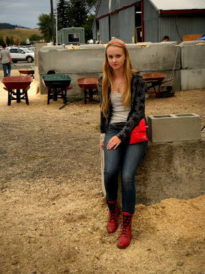
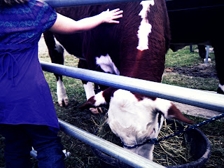 So I did the assignment...I decided to take pictures of people interacting with animals although I did get some of just people.... here is one of those, plus one of a little girl petting a cow... I'm not sure whether or not I like the one on the left........ Please let me know what you think about that one! By the way, I edited these on picnik... I changed the exposure on the second two by using 'advanced' on exposure in edit mode... I darkened the shadows and lightened the higlights for a contrast... I used ortonish, faded a bit, on both, along with cross process and and a few other things. This first picture has nothing to do with my topic but I liked it...I used HDR-ish and a little bit of ortonish, both mostly faded, on that one. I think orton-ish on picnik is my favorite tool...sadly, my computer is reeeaaally slow right now and could crash any day... so I couldn't upload Picasa- there is too much room being taken up on the computer right now. I'm actually using my sister's laptop for this.....oh well. Please comment! :) -Audrey S
Fair 2010
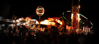
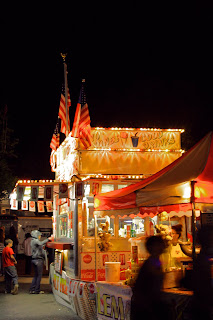 Everyone keeping busy at the fair! In the photo of the Snow Cones booth I used the AV setting on my camera and adjusted the light to brighten it up. In the photo of the rides, I used Picnik to focus the color of the picture in the center and to dull the outer-edges so that the ball of light would stand out:)
Saturday, September 18, 2010
My Photo Blog
Here is the link to my blog:
http://shannasdarkroom.blogspot.com/
I apparently had the invite to the blog all along and simply didn't know what to do with it. I feel rather technologically silly now. Thanks for your patience!
http://shannasdarkroom.blogspot.com/
I apparently had the invite to the blog all along and simply didn't know what to do with it. I feel rather technologically silly now. Thanks for your patience!
Thursday, September 16, 2010
Wednesday, September 15, 2010
Street Photography Assignment
Subscribe to:
Comments (Atom)


